Microcopy – How to Use Microcopy for Branding & Conversion?
Many brands today understand that microcopy cannot be separated from a great user experience in a website or an app, and they already make a connection between microcopy and the websites’ conversions rate.
It makes sense, since all humans use words to communicate with each other. Researches show that when we interact with a website or an interface, we are aware that we communicate with a machine but still expect a human treatment; we want compliments, explanations and even a sense of humor. Therefore, microcopy has become a very important factor in improving the usage, personalization and even the branding of different companies.
What is Exactly Microcopy?
To summarize, microcopy are short copywriting sentences or just single words used to help, guide and give a feedback to users in everything that has to do with taking an action in an interface.
You can find microcopy in different parts of an app or a website:
- Error/approval messages (including 404 messages)
- Form’s fields
- Payment and security instructions
- Menu bars and buttons
- All the “dead spots” of an interface (such as loading pages)
- Website usage instructions
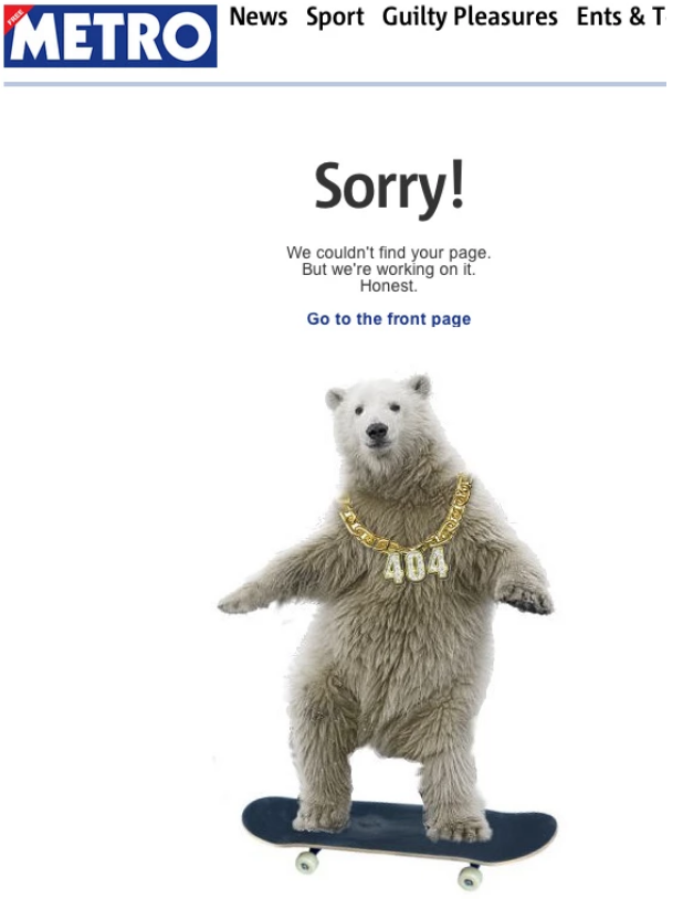
For example, Metro tells the user they reached an error page in a short, funny way.
Why is it Important to use Microcopy?
1. Microcopy explains visitors how to use the site and encourages them to stay in it
Struggling with navigation on a website is a huge factor causing users leave the site. If visitors can’t easily find what they are looking for, there is a greater chance they would leave it without even trying to do anything else. In some parts like buttons, links, instructions and error messages, microcopy can be used to guide the visitors and making them stay on the right path to a conversion.
Important tip: keep it simple in central places where you welcome visitors (such as the websites’ homepage), don’t try to be funny or sophisticated there. Many websites try to show that their menu bar is smart when they really just make it hard for the users to find what they want. Stick to the normal and familiar format and keep the great punches to other places.
2. It helps improving the conversion rate:
When you think on improving a conversion rate you might decide to change the call to action (CTA) buttons, their design or their placement. It is not always a good idea. Try changing the wording a bit – it can be very helpful and improve conversions ratio. One of the most important things for users, especially in ecommerce sites, is the website’s reliability and trust. Potential buyers would skip the conversion part if they think the website isn’t trustworthy. Using micro copy can help the website make users trust it by promising them that their personal details are safe and protected. For example, a detailed error message for a user that has put his/her credit card number, explaining the problem (“Your credit card number is too long”) would make a better reliability than a general error message that doesn’t explain how to fix the error.

In One week website there is a call to action on the signing up to newsletter button that highlights the value for the subscriber and helps improving conversion rate.
3. Microcopy can also help getting conversions that aren’t sales
A newsletter sign up is a great place to use microcopy. One option to prevent the users’ concern of providing their email address is to let them know what they can get in return. You can tell them of discounts or just refresh the wording of a standard newsletter pop up.
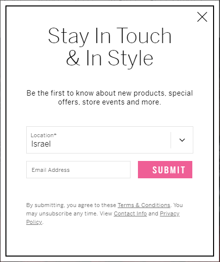
Victoria’s Secret tells the users what they get if they’ll sign up and encourages them to stay in touch.
4. Microcopy helps in branding
One of internet marketing challenges is trying to segregate the website from its competitors and give it a personality or a unique and distinct voice by using microcopy. Many brands use the short text pieces to highlight the brand, and even sometimes to show the less formal side of it.
What NOT to do with microcopy:
Don’t annoy your audience. Many times websites want to impress users, but all they do is exactly the opposite. Remember to follow some rules:
- Don’t make too many jokes – a funny joke stops being funny at some point. Put the “funny” sentences in different and strategic parts of the website so users don’t bump into them too soon. Like salt, humor is supposed to spice micro copy and not make it impossible to swallow.
- Don’t try too hard – microcopy is supposed to be short and to the point. If you need to explain something in more than one sentence, then something is probably not clear in your interface. Besides, microcopy is a text that is put in small areas (buttons, fields), so take into account the graphic side of it and don’t exaggerate with words on a small button (it will not be readable on mobile).
- “No thanks, I prefer to stay stupid”– how many times have you seen this type of microcopy, which aims to shame the users for not wanting to sign up to a newsletter? Leave the user alone, negative feelings don’t make conversions, unless they come in a really humoristic way to a specific audience that knows how to take it J
Conclusions and rules for microcopy writing:
There are endless examples of UX writing and can be found everywhere; once you understand it you know it’s important for your website in order to create a unique brand and mostly to increase the conversion rate.
Remember these guidelines when writing a great microcopy:
- Match the text to both the brand and the audience
- Use microcopy to make users feel safe and protected on your website
- Write short and bright texts
- Be creative, but don’t try too much
- Place user experience as first priority. Microcopy is a tool, not a goal. The goal is to make UX easier and efficient.
Related Articles
-

2020 in Digital Marketing & Predictions for 2021
There aren’t enough bad words to describe 2020. We’ll...Read More -
Know Your Enemy – Competitors Research for SEO
Competitors’ research is an essential first stage in the...Read More -

Guide to New Google Expanded Ads
In the last year Google continued to reinvent its...Read More